Headspace

Transforming the smartphone, into a tool that inspires outdoor adventure

2 week individual project
UX | UI | Product Design

The challenge

Headspace, a platform focused on emotional well-being, planned a new social feature. My role was to ensure it integrated seamlessly into the app, reflecting its values.

Problem statement

"Paul struggles with the overwhelming nature of constant digital connectivity.

He values time away from screens and seeks opportunities to engage engage in mindful, real-world activities."

The results

Mindfulness from virtual to reality.

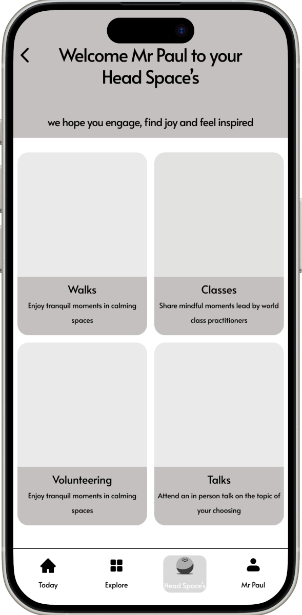
Enter Head Space's—a directory of mindful activities, moments from your door. Discover in person activities, connect with experts and make new friends along the way...
Let's explore how.
Final Prototype

Project overview

Understanding how people practiced mindfulness and how competitors incentivise these behaviours was crucial to deliver user-centered features.

With just two weeks to create a viable product and compelling proof of concept, my product roadmap ensured the project stayed on track delivering a successful outcome.

Understanding the consumer landscape

user research findings & insights

To ensure my feature addressed real world challenges, I conducted five semi-structured interviews with participants who practiced mindfulness and had used Headspace or a competitor.
5/5
Many reported getting caught in cycles of scrolling on social media.

Habitual checking off notifications, or using apps without a clear purpose. One participant mentioned "When I leave instagram i slightly hate myself for spending so long on there."
4/5
Exercise, especially outdoors and with others like Parkrun, provided an emotional lift.

A sense of accomplishment, and community. One participant, who didn't exercise regularly, was looking for ways to include regular exercise into their routine, recognising the benefits it could bring.
5/5
Respondents mentioned that a sense of achievement improved their mood.

A sense of achievement created feelings of success and self-worth. It helped combat feelings of frustration or inadequacy, increasing confidence and contributing to overall well-being. “I feel happy when I accomplish something, I feel proud of.”
“Attention demanded from tech is literally the antithesis of what is needed for wellbeing.

Wellbeing requires attention in and around yourself.”
Research Participant
Interview Synthesis. Click to Enlarge.

Ideating

designing mindful journeys

With interviewees skeptical that another attention-demanding app would aid their wellness journey. The opportunity lay in shifting how people perceived their device usage.
The Smartphone, A Tool To Inspire Exploration

Transforming the smartphone into a learning tool that made Headspace’s signature activities communal, we could address consumer skepticism, offer what they truly wanted, and maintain engagement.
The Chosen Path

While there were several ideas to prototype—wellness directories, community volunteering, message boards—the flow I focused on was 'guided walks. Transforming the smartphone into a tool that leads the way.

Wireframing

Introducing Headspaces

key features

1. Directory of Local Events.
Reducing the paradox of choice, by simplifying event planning. Encouraging in person mindful activities, all in one convenient platform
2. Achievement Tracker.
Visual representation of achievements and goals. Creating a sense of accomplishment and further encouragement.
3. Walk Insights
Learning about other users' experiences, up-to-date weather information, and route highlights gives users all the information needed to plan an enjoyable and safe walk.
4. Compass, Explorer Mode.
Encouraging users to explore and navigate independently, solving the problem of passive, step-by-step route following and enhancing the sense of adventure and personal discovery.

Designing the Application Onboarding Flow

Seamless integration was a fundamental requirement of the project. Having already registered and signed up, the importance here was to keep the user journey short, comprehensive and exciting.

Iteration 1

  • Screens are overwhelming, too much text and imagery is very small
  • Lack of clarity and hard to know what to focus on

Iteration 2

  • Unclear how to progress through onboarding
  • Removal of Navigation bar to create a more immersive experience

Iteration 3

  • Gently moving shapes to create a sense of calm
  • Overlay increases focus on key areas of screens
  • 'Next' CTA button clearly highlighted